Executive Summary
Many long-term investors are pursuing investment policies that are sub-optimal, assuming their investment objective is long-term growth of capital after compensating for inflation, taxes and investment costs. This article describes the problem and proposes a solution.
To be successful, the key point a long-term investor must grasp is that short-term volatility is your ally. Rather than shying away from volatility, you should embrace it and be patient. With the passage of time, your patience is very likely to be rewarded. Don’t fall into the trap of attempting to apply short-term measures of return, risk and “portfolio efficiency” to a long-term portfolio. The use of short-term metrics is very likely to lead you astray.
This article addresses these questions:
- What do we mean by “long-term capital?”
- How should a long-term investor think about the relationship between risk and return?
- What are the limitations of standard deviation, the Sharpe Ratio and other traditional measures of risk? Why does reliance upon those measurements lead long-term investors astray?
- What costs are associated with seeking to dampen the volatility of portfolio returns? How do those costs impact the returns of long-term investors?
We define “long-term capital” as capital that will remain intact for multiple decades. Many ultra-wealthy families have a pool of capital held in very long-term trusts or other entities where the investment objective is long-term growth of capital.
Investors are bombarded with investment news, the vast majority of which attempts to explain market movements based on current events. The news focuses on short-term volatility in investment markets. Investment professionals charge their clients handsome fees claiming they can protect investors from losses during market downturns – although history shows investment professionals have not been very successful in doing so.
Investment management professionals are by-and-large compensated based on short term results, and most investment strategies have a short-term focus. For example, many actively managed equity mutual funds, whose results are ranked quarterly by the various rating services, have annual turnover ratios well in excess of 100%. It is also very common for investment professionals to be compensated on pre-tax, rather than after-tax, before-inflation returns. The result is that the investment industry has taught private investors to overestimate market risk and to pay insufficient heed to long term risks, such as the erosion of purchasing power due to inflation and taxes, which are precisely the investment risks that contribute to erosion of private wealth over generations.
Most people know that the average annual return for stocks has been higher than the return for bonds and cash. The return differential has been in the range of 3% to 7% per year on average most of the time. This return differential is known as the “equity risk premium.” Why has the equity risk premium been so persistent? Various academic studies have attempted to explain this phenomenon. Many of the studies point to investors’ aversion to short-term volatility as a key factor supporting the equity risk premium.
Investors are so focused on trying to avoid (temporary) short-term losses that a whole new investment industry has grown up around the concept of “volatility management.” This new industry has created a cornucopia of structured products, option strategies, and Exchange Traded Funds – all claiming to mitigate downside risk. Structured products simultaneously appeal to an investor’s greed and fear. They claim to mitigate downside risk while allowing an investor to capture a portion of the upside potential of various asset classes. However, structured products suffer from a lack of transparency regarding their internal costs. The investment banks selling these products expect to earn handsome returns on them. All these products are poor choices for long-term investors.
The investment industry measures “risk” with statistics such as the standard deviation of annual returns, the Sharpe Ratio, and the VIX index, which are typically based on short time periods. For long-term investors, short-term volatility is not risk. Instead, long-term investors should focus on inflation and investment exposures that may result in the permanent loss of investment capital. For example, permanent loss of capital might occur as a result of an investor making a concentrated investment in the securities of a single enterprise which suffers serious and permanant financial impairment after the investment occurs, or as a result of fraud.
Long-term investors should build diversified portfolios using asset classes that are expected to produce the highest return – after adjusting for inflation and taxes – over a very long time horizon. Long-term investors should reject short-term risk metrics, such as the standard deviation of annual returns, as a proxy for “risk.” Short-term volatility should be taken into account only when assessing the investor’s capacity– both psychological and financial capacity – to be able to ride out bear markets without feeling pressure to sell securities at what will later be judged an inopportune moment. Unfortunately, much of the advice wealthy families receive runs counter to the main idea of holding high returning assets over a long time horizon. And, investors are encouraged to focus on risk metrics that utilize standard deviation as a proxy for “risk.” (Note: since the remainder of the paper spends so much time on Sharpe ratio, should we define it more clearly? A simple definition is return per unit of risk.)
The following charts show why price volatility is not a good proxy for long-term investment risks.
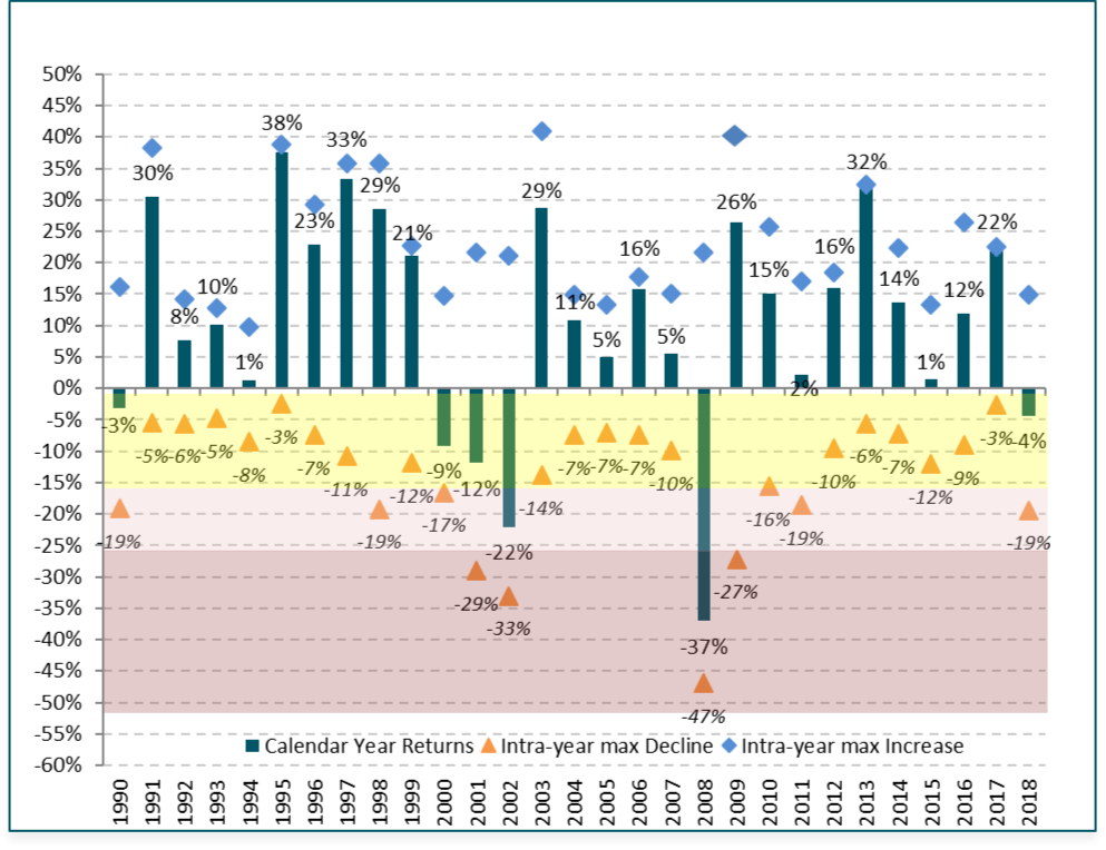
Chart 1 shows calendar year total returns for the S&P 500 stock index vs. the percentage maximum gain and loss within each calendar year. For example, in 2018, the S&P 500 Index return was – 4% (indicated by the green bar). However, during 2018 the Index was up 15% at its highest point (indicated by the blue diamond) and down 19% at its lowest point (indicated by the orange triangle). Even in most years with large negative returns, the Index was up by a substantial amount at some point during the year (for example, 2000 – 2002, and 2008). That is a lot of volatility!
Chart 1: 1990 – 2018 Annual Returns & Maximum Intra-Year Decline/Increase S&P 500 Index Total Return
Charts 2 through 4 show what happens to the volatility of investment returns and the average annual return as we extend the time period over which we measure returns. Charts 2 through 4 are presented on the same scale to make comparisons easy.
The average annual total returns shown in Charts 2 through 4 have been adjusted for inflation, but not for income taxes. Inflation-adjusted total return data is readily available from several sources. Adjusting for taxes payable on dividends, interest and capital gains is a far more complicated matter. Those adjustments are beyond the scope of this article. Obviously, under the current tax regime, a 100% stock portfolio is more tax-efficient than a 60% stock/40% bond portfolio, and the 100% corporate bond portfolio would be the least tax-efficient. We used the corporate bond index because historical data is readily available. The after-tax return for corporate bonds is similar to the return for tax-exempt bonds.
Chart 2: Average Annual Real Total Return for S&P 500 for 1, 5, 10- & 20-Year Rolling Periods 1949 – 2018
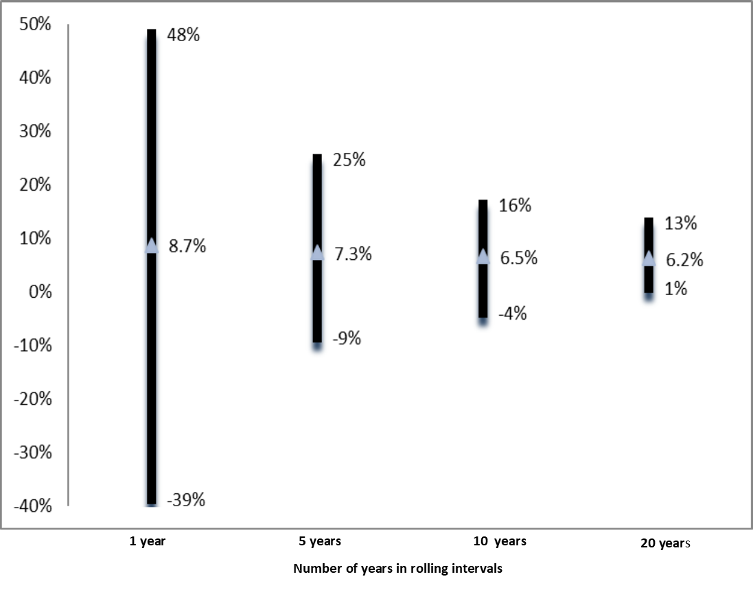
Chart 3: Average Annual Real Total Returns for Long-Term Corp Bonds for 1-, 5-, 10- & 20-Year Rolling Periods 1949 – 2018
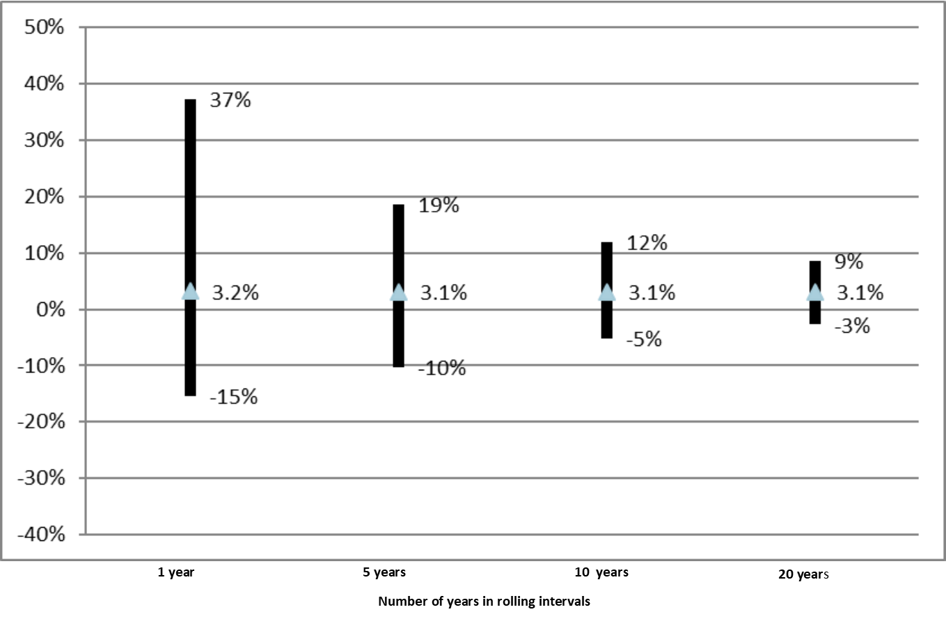
Chart 4: Average Annual Real Returns for 60% Equity /40% Fixed Income for 1-, 5, 10- & 20-Year Rolling Periods 1949 – 2018
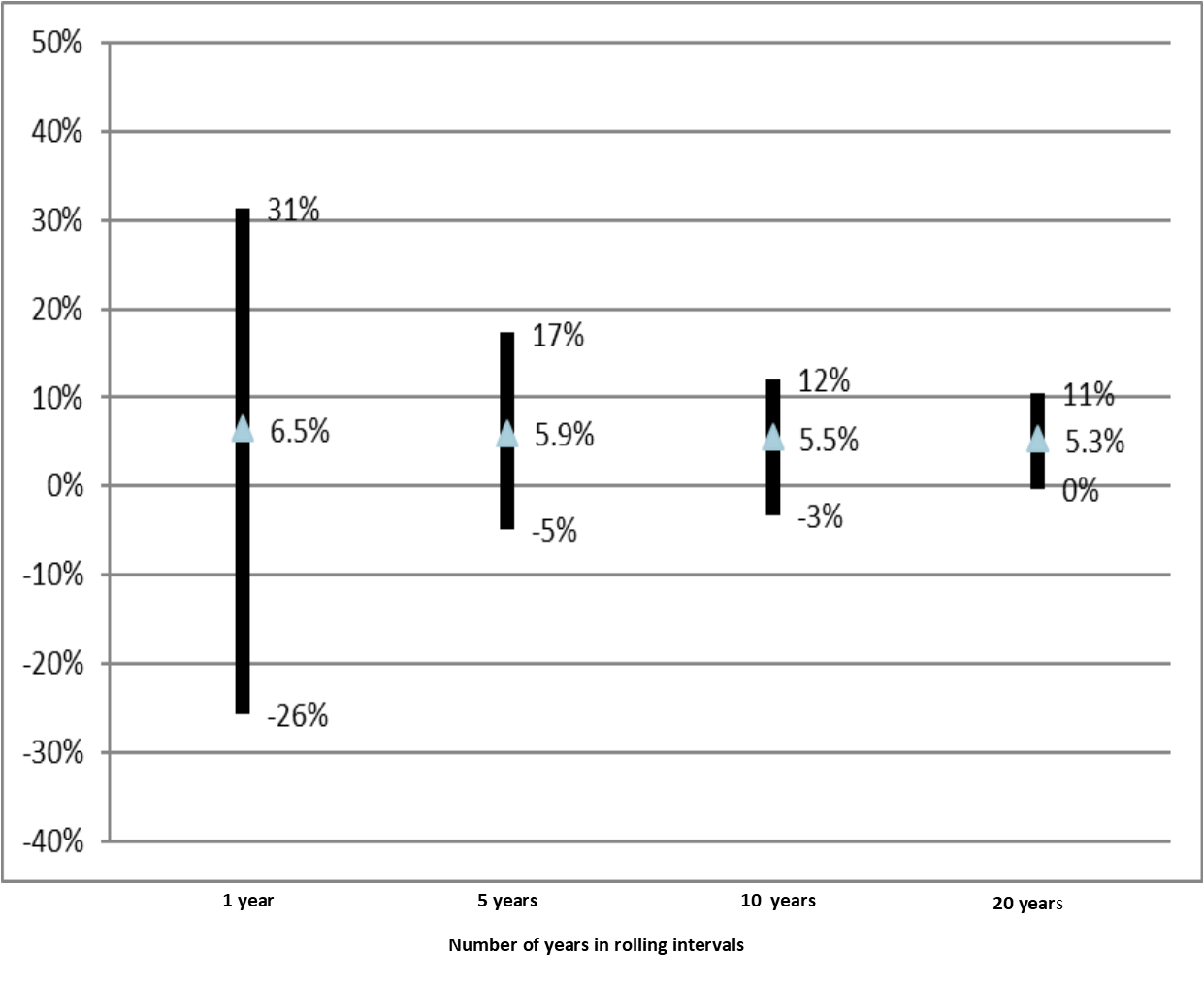
One of the most striking features of Charts 2 through 4 is that returns for all asset classes demonstrate “reversion to the mean.” For one-year time periods there is considerable variation in the range of returns. As we extend the length of the measurement period, the variation in outcomes decreases across all asset classes.
In each of these charts, the first bar represents rolling one-year returns, the second bar represents rolling 5-year returns, the third bar represents rolling 10-year returns and the final bar represents rolling 20-year returns. The top of each bar shows the best return, the bottom of the bar shows the worst return, and the diamond shows the average annual return.
Chart 2 examines the returns for US stocks represented by the S&P 500 Total Return Index for the period 1949 through 2018. Charts 3 – 5 show annual average total real returns for the S&P 500 Index, the Long-Term Corporate Bonds, and a portfolio of 60% S&P 500 & 40% Long-Term Corporate Bonds. The data shown in Charts 3 – 5 are pre-tax returns that have been adjusted for inflation. The time period for Charts 2-4 is January 1949 through December 2018 and the time period for Chart 5 is 1990-2014.
For example, in Chart 2 which shows real total returns for the S&P 500 stock index, we see that for one year rolling periods there is a substantial risk of loss. The worst year produced a loss of -39% (2007). (Chart 1 shows the S&P 500 Index was actually down 47% at one point during that year.) When we shift to 5 year rolling returns, the worst five-year period produced a return of -3%, and bonds did not do much better at -2%. When we extend our measurement period to rolling 20-year intervals, there were no period in which stocks, bonds or the 60/40 portfolio lost money. The worst 20-year period for stocks produced an average annual return of +6%.
Also in Chart 2, we see for 10-year rolling periods (the third bar), the worst 10-year period produced a real pre-tax average annual return of -4%, and the best 10-year period produced an average annual return of +16%. The average annual real pre-tax return for all 10-year periods from 1949 to 2018 was +6.5%. From other data, we know the average annual return for 10-year rolling periods before adjusting for inflation was +10.4%. So, inflation knocked about 4% per year off the total return. Taxes and investment costs would have further reduced the return. We know from other data that active management of equity portfolios costs investors at least 2% per year in fees and taxes, with taxes accounting for most of that. That would have reduced the net average annual return after inflation, taxes and investment costs to about 4.5%, assuming the active managers at least kept pace with the index. A portfolio consisting entirely of tax-efficient index investments would probably have done at least 1.5% per year better than the actively managed portfolio.2
Charts 5 and 6 illustrate the key issue long-term investors need to understand: short-term measures of return and volatility can lead long-term investors astray. Long-term investors should invest in assets that have the best potential to produce returns high enough to overcome the combined impact of inflation, taxes and investment costs – and mostly ignore short-term volatility.
Chart 5: Efficient Frontier Simulation For Portfolios Ranging From 100% Cash & Fixed Income to 100% Equities Based On Historical Data 1990 – 20143
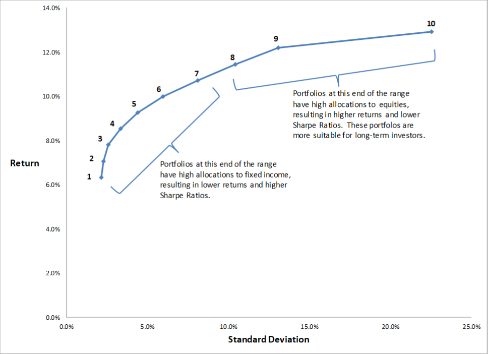
Chart 5 shows the efficient frontier calculated by a mean variance optimizer using historical return data for the period 1990 – 2014 of the asset classes Ballentine Partners uses to construct portfolios for private clients. Those asset classes include: global equities (both public and private equities), global real assets, global alternative assets, US bonds, and cash. The dots numbered 1 – 10 along the blue curve represent 10 different portfolios. Portfolio 1 consists of cash and fixed income. It has the lowest average annual return but also the lowest average annual standard deviation of returns. Portfolio 10 consists entirely of global equities. It has the highest average annual return and has a considerably higher average annual standard deviation of returns than the other portfolios.
Chart 6: Modified Sharpe Ratios For Portfolios Ranging From 100% Cash & Fixed Income to 100% Equities Based On Historical Data 1990 – 20144.
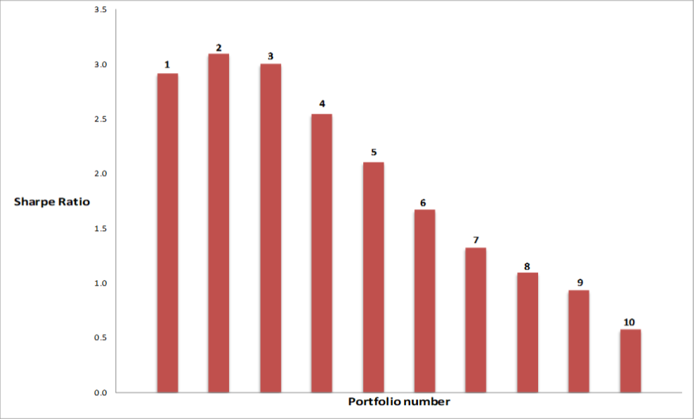
Chart 6 shows the various Sharpe Ratio values corresponding to the 10 portfolios on the efficient frontier in Chart 5. The small numbers (1 – 10) in Chart 5 along the efficient frontier line correspond to the numbers in Chart 6 at the top of each bar for the Sharpe Ratios. Thus, portfolio #6 in Chart 5 on the efficient frontier line represents a portfolio with an expected return of about 10% and a 6% standard deviation of annual returns. In Chart 6, the bar labeled “6” illustrates that portfolio #6 has a Sharpe Ratio of about 1.8.
Comparing Charts 5 and 6, we see that all portfolios after #3 have increasing average annual returns but steadily declining Sharpe Ratios. The “most efficient” portfolio according to its Sharpe Ratio is portfolio #2, which is the second-lowest returning portfolio. Although all portfolios lie on the efficient frontier for asset allocation, the higher the percentage of equities in the portfolio, the less “efficient” the portfolio becomes according to its Sharpe Ratio. That happens because the Sharpe Ratio uses the standard deviation of returns to measure the “risk” of a portfolio. The higher the percentage of equities in the portfolio, the higher the standard deviation of returns, and the lower the Sharpe Ratio.
But, as we have explained above, “risk” for a long-term investor should be measured relative to the investor’s long-term goals, not by a short-term measure of portfolio volatility. The Sharpe Ratio does not take into account the fact that returns for equities (and all other asset classes) tend to revert to the long-term average return as we extend the measurement time period, as shown in Charts 2 – 4. Equities are exactly the asset class that is most essential for long-term growth of capital after adjusting for inflation, taxes and investment costs. Thus, a long-term private investor who tries to select an “efficient portfolio” that lies on the efficient frontier and has the highest Sharpe Ratio is likely to wind up with a portfolio that is very suboptimal because the portfolio return – after adjusting for inflation, taxes and investment costs – may not be sufficient to preserve capital, let alone grow capital.
To be successful, the key point a long-term investor must grasp is that short-term volatility is the ally of the long-term investor. Rather than shy away from volatility, the long-term investor must be willing to embrace it and be patient. With the passage of time, the investor’s patience is very likely to be rewarded. The investor must avoid falling into the trap of attempting to apply short-term measures of return, risk and “portfolio efficiency” to a long-term portfolio. The use of short-term metrics is very likely to lead the investor astray.
1 This paper is based on a presentation by Drew McMorrow to the Family Office Exchange.
2 The analysis supporting this statement is beyond the scope of this article. However, the analysis is readily available in the public domain in numerous articles and books. Other articles on Ballentine Partners’ web site include references to some of the best resources.
3 Data Sources: Dimensional Funds’ total Return Series, Lipper TASS Hedge Fund Return Series, and Cambridge Associates Private Placement Return Database. Calculations done by Ballentine Partners using Ballentine Partners’ model portfolios.
4.We modified the Sharpe Ratio by assuming a risk-free interest rate of zero rather than referencing the rate of a real investment that is risk-free.
This report is the confidential work product of Ballentine Partners. Unauthorized distribution of this material is strictly prohibited. The information in this report is deemed to be reliable but has not been independently verified. Some of the conclusions in this report are intended to be generalizations. The specific circumstances of an individual’s situation may require advice that is different from that reflected in this report. Furthermore, the advice reflected in this report is based on our opinion, and our opinion may change as new information becomes available. Nothing in this presentation should be construed as an offer to sell or a solicitation of an offer to buy any securities. You should read the prospectus or offering memo before making any investment. You are solely responsible for any decision to invest in a private offering. The investment recommendations contained in this document may not prove to be profitable, and the actual performance of any investment may not be as favorable as the expectations that are expressed in this document. There is no guarantee that the past performance of any investment will continue in the future.